What Does Your Corporate Photograph Say About You?

November 04, 2013

It is SO important to have a pre-shoot consultation with your photographer when thinking about having a professional portrait taken.  Have a real good think about what aspects of your personality you want to convey in your photograph.  This is not as easy as it seems.

Some points to think about :

  • Do you want the shoot in a studio set up or out on location.  Professional lighting in a studio has a more classic look.  The location however might depend on your career.  For example a Personal Trainer may want the shoot outside where this can convey a health and fitness look and some movement can be incorporated in the portrait.  A Banker on the other hand will want a more conservative look with classic lighting.
  • What to wear-very important to wear something you are comfortable in, this may sound obvious but clothes need to be ironed and smart whether a casual or smart look.  Colour is quite important, sometimes white or black can make you look washed out.  A nice blue shirt that matches your eyes looks good and this will enhance your portrait.
  • Make up-I always believe you should try and look as natural as possible so a normal covering of make up is good nothing too heavy.  It may be advisable to book a make up artist if you want a really professional look.
  • Hair-Same as make up advice really, don't try and have a new hair cut just before having your portrait because you may not like it, stick to your natural look but must look neat and tidy.
  • Body Language-I think this is one of the most important points of taking a portrait.  Open body language is key, not crossed arms, a smile makes you look more approachable.  This is down to the skill of your photographer to make you feel relaxed and to bring out the best in you.
  • Props- do you want props in your shoot to inform clients more of what you do or who you are?  For example for a photographer should a camera be included in your photograph?
  • Black & White or Colour- Again these can both say different things about you, colour maybe is more welcoming, black and white classic business look.

Some examples of good portraits :


This portrait was shot in a studio, this client plays guitar in a band and we felt it was very important to include his guitar in his portrait.  I think the portrait looks creative and fun and approachable and represents a part of his personality that is very important to him.


I really like this portrait, this company director wanted a look that was smart and professional yet also approachable and I think we achieved this.  Black and white adds a cool look and his open body language invites you into the portrait.

The famous author Jacqueline Wilson in action.  This is a good example of a portrait shot on location, it speaks volumes about her personality.  Her large rings, her book, again her body language leaning forward and engaged in conversation.

A Corporate photography session with me would include a conversation about what you would like from your portrait.  Then the shoot will take 1-2 hours I usually come to you, then you will receive a contact sheet of 30-40 images or view them online, you then choose your favourites.

Contact me to arrange your free photo consultation email  [email protected] or phone 07767 776839.

Amanda Duncan Photography, Life, captured


Your Surrey Wedding Magazine August September 2013

August 22, 2013

Congratulations to Michelle and Brendan who had their wedding published in Your Surrey Wedding Magazine in the August and September edition at Gorse Hill Hotel Woking in Surrey.


Simple Tips to Improve your Photography Eye !

May 22, 2013

Simple Tips to improve your photography EYE !

 
Everyone can take a good photograph these days especially with all the great cameras on sale you can't really go wrong.  Also making a good image is subjective to the individual. However there are some golden rules that help all the visual elements look right together.
 

Simple Tips to Improve your photography eye - Telling a story

Tip 1
Telling a story
 
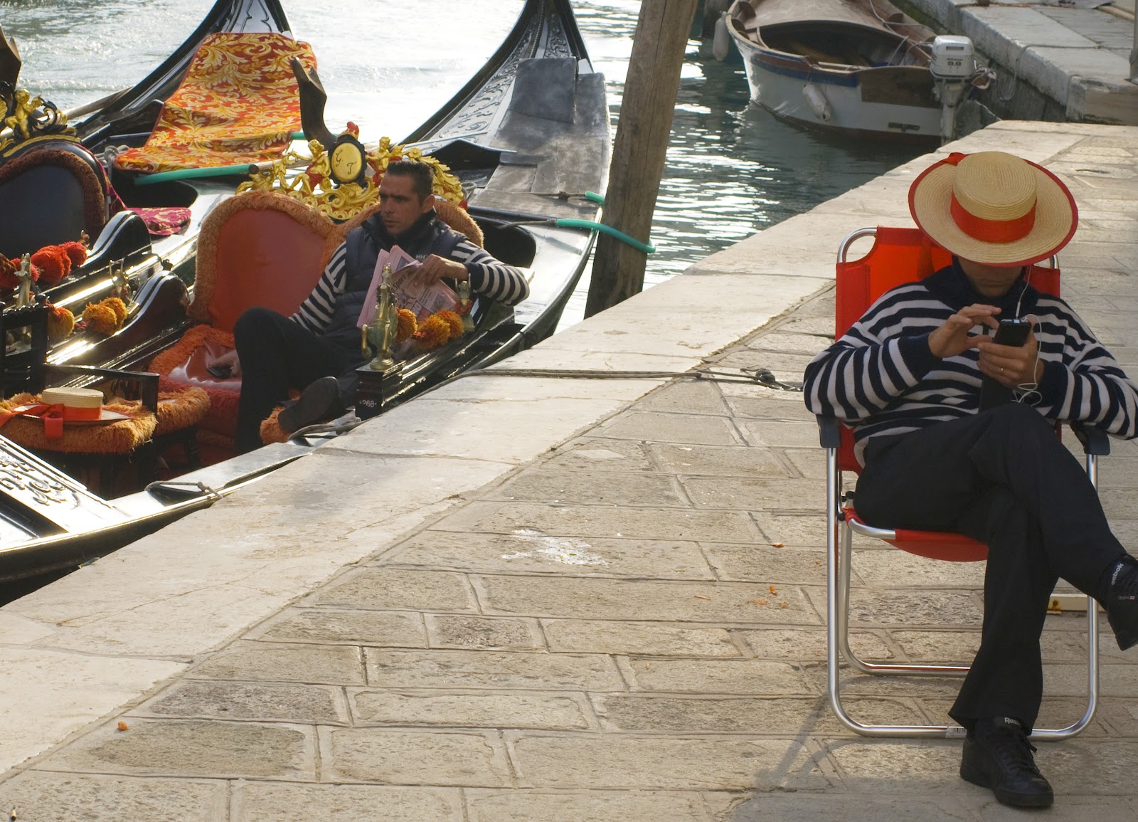
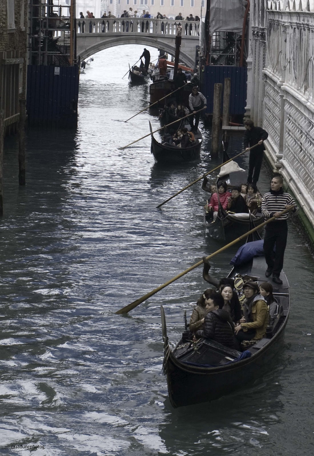
This is my favourite part of photography if you can tell a story as well as artistically producing a great shot you have a winner.  The above shot in Venice is mixing old with new, I found it really funny that the Gondola man was on his mobile phone whilst dressed in such an old fashioned, traditional way.
 
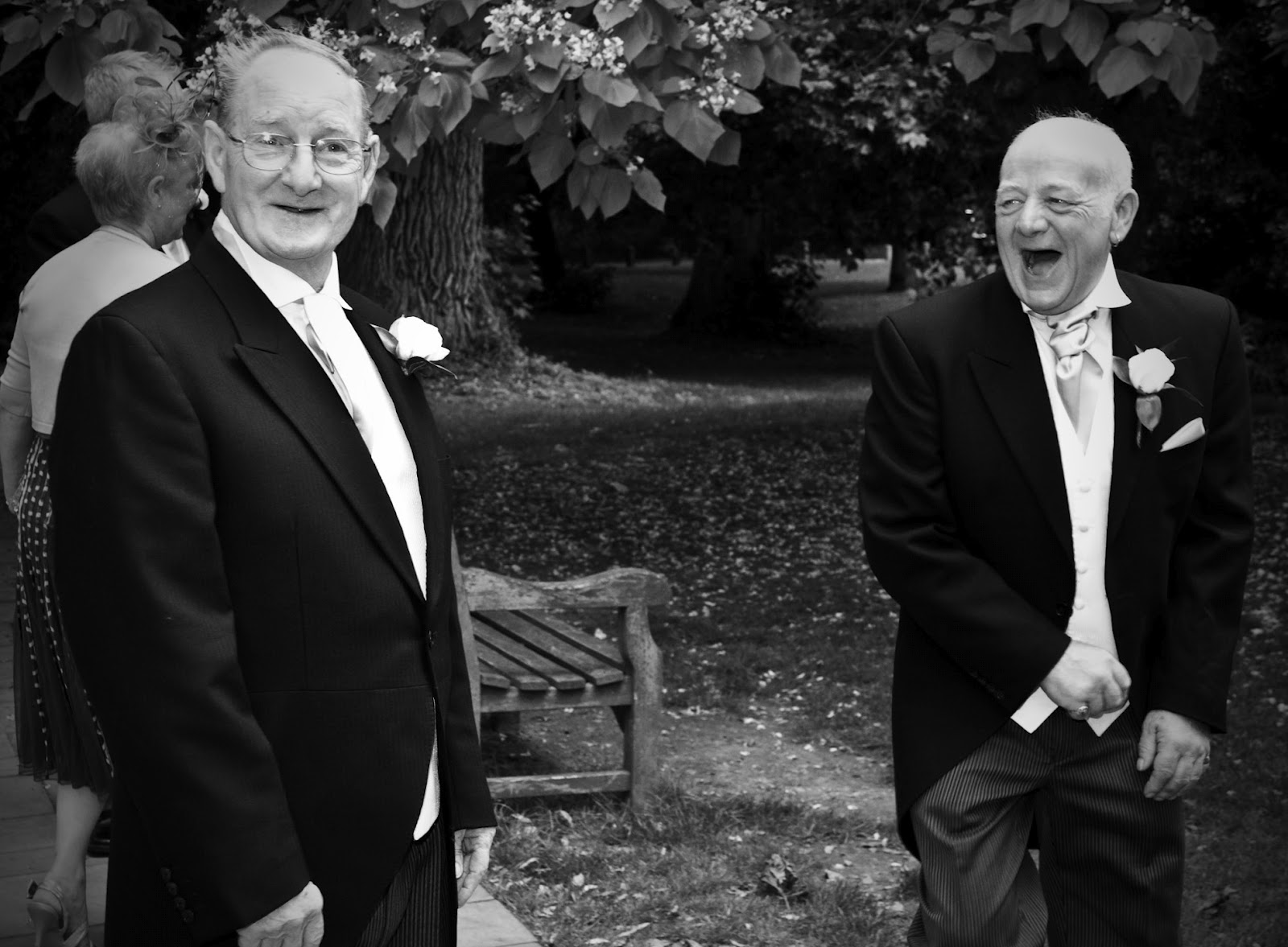
 Love this shot of the two fathers of the bride and groom enjoying a joke on their children's big day, they teased each other all day.
 
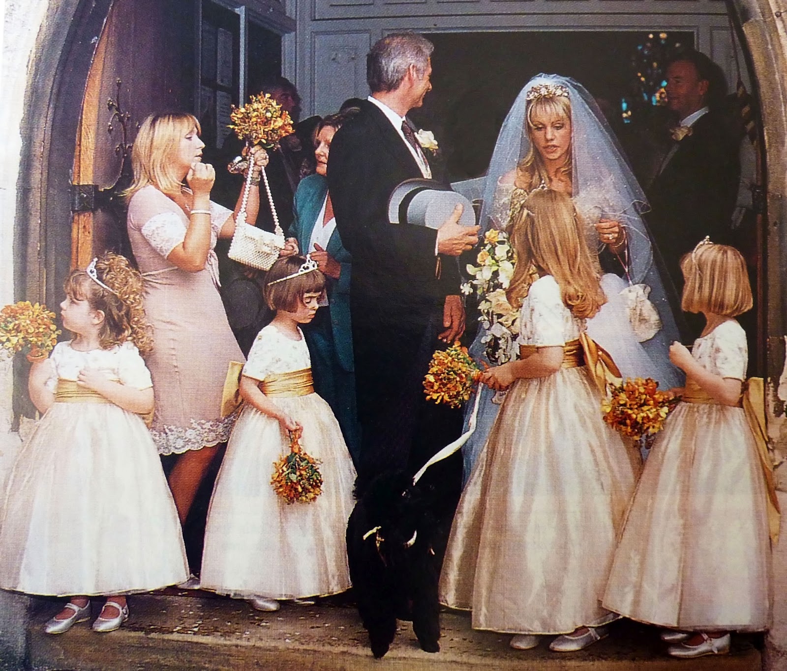
This was a gem of a wedding as some of the bridesmaids were poodles, if you look closely at this photo not one person or animal is looking at the camera priceless !!  I find the photographs that I remember most are the ones that tell a story and an image is so much more powerful than words.


Simple Tips to improve your photography eye!! White Space

 
Tip 3
White Space
 
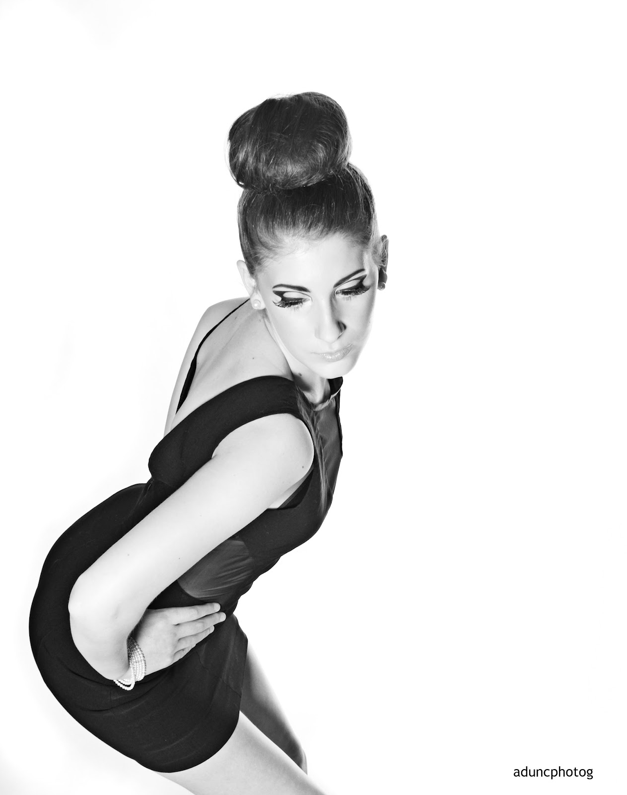
What is white space?  It is sometimes more important than the stuff that is in it.  It is the space that surrounds your main subject in a photograph.  See example :
 
 It is sometimes known as negative space.  It allows your eye to travel around the object and gives it a resting space..  Space calls attention to content.
 
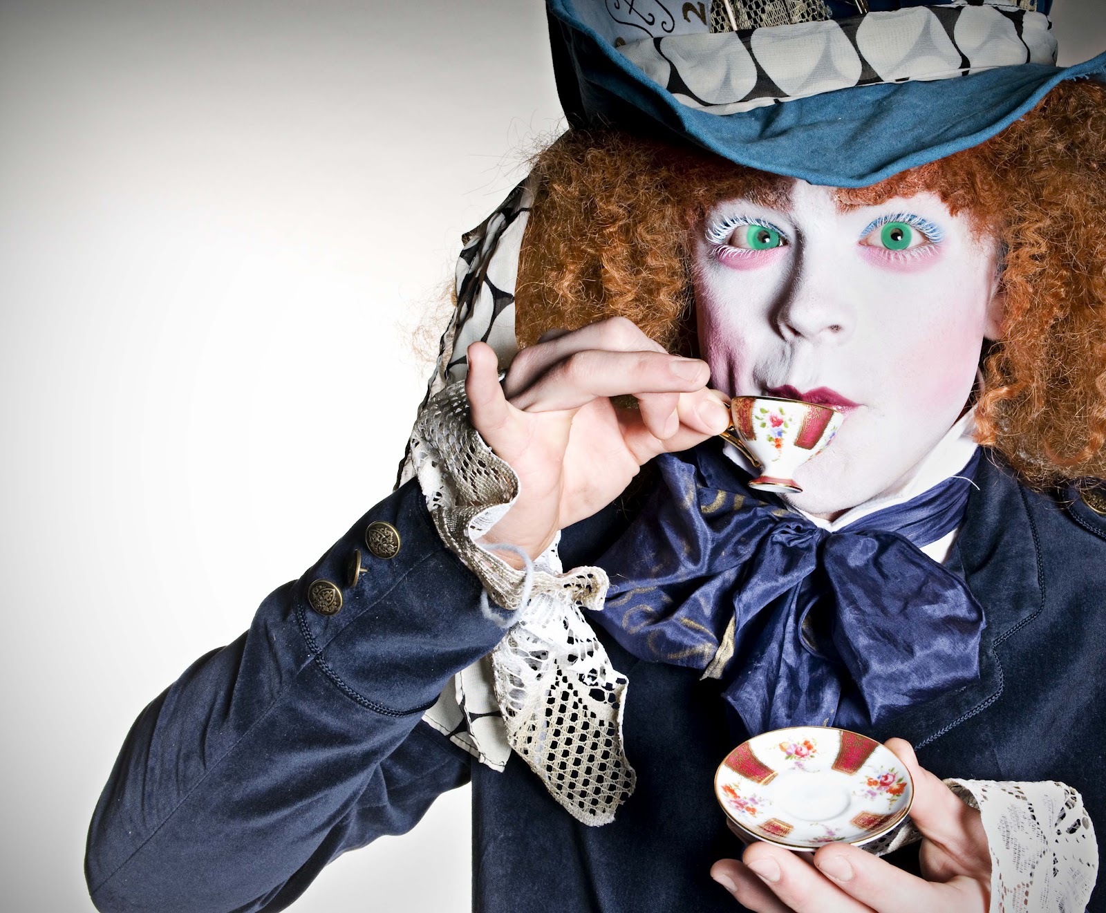
 White space is just as much a shape as the main subject together they make up composition.    If the space gets filled up it feels oppressive, and a lack of negative space confuses the viewer.  It is I feel one of the most important points to deal with when creating an image.  The photograph below for example needs the space on the left to compensate for the eye to take in all the fabulous make up and costume of the model.


Simple tips to improve your photography eye! Tip 4 Colour & Tone

 
Tip 4
Colour & Tone
 
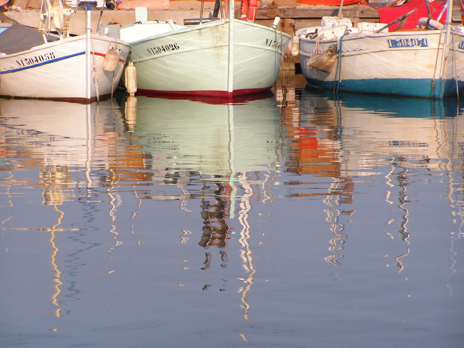
Colour and tone greatly contributes to how you feel about a photograph.  We are all conditioned to connect a colour with an abundance of psychological and emotional meaning, and this can vary tremendously between cultural groups and individuals.  For example blues and greens create a colder feel, see example below 


Whereas if you look at this next photo which is simulaar to the one above I shot at a different time of day with warmer colours such as red it creates a very different feel.
 
The range of tonal values also effects a photograph.  Large dark areas are are associated with strength and mood.  Whereas images that are light suggest softness and space.
Try and use colour to help emphasize a subject.  For example the image below would not have worked if the little girls dress were in another colour.  Again simplicity makes more of a powerful photograph and that rule is applied to colour aswell. 


Simple Tips to improve your photography EYE! Tip 3 The rule of thirds.


Simple Tips to improve your photography EYE! Balance


Tip 6
Balance
Again every picture is subjective yet there is always a balance when looking at a really good image, one that makes the image memorable and pleasing to the eye.  Balance dosen't mean that everything in the picture has to be in the centre quite the opposite infact, the eye takes in the camera viewpoint, tone, colour, framing and detail.


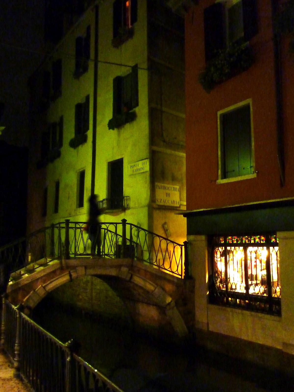
For example in this photograph the figure crossing the bridge has been captured just as they pass under the middle of the building creating a strong vertical line however either side of the figure the green colour tone balances the picture, also the red light right at the top of the picture helps the eye travel upward.


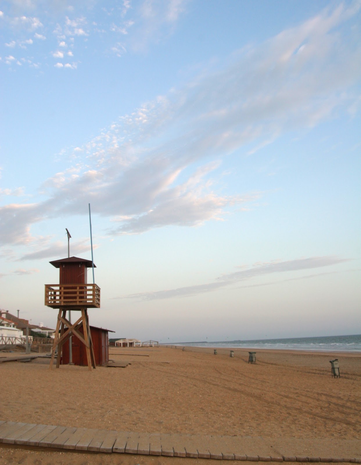
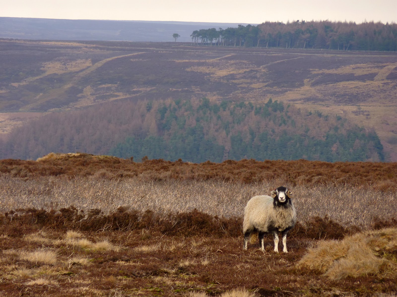
When the picture has lots of landscape detail it feels enclosed yet adding more foreground makes such a scale difference giving good depth of field.
 

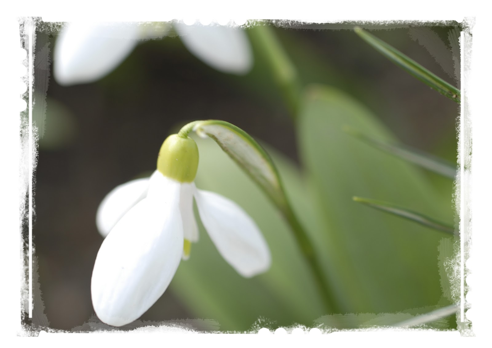
Finally sometimes shapes and proportions are objects in their own right, sometimes how they are cropped creates balance.
 
 
TIP 7
STRUCTURE
 
When taking a photograph you have to work within a frame.  Think about what you see through the view finder or back of camera try and think of it as a blank piece of paper.
First decision is whether you want horizontal or vertical.  Your eye scans horizontal pictures best like reading of a book left to right.  Using horizontal lines or shapes within creates a strong visual look.
 
Vertical photographs are helped if you use lines or shapes to draw the eye in.  Also your eye makes comparisons between the top and bottom of the image, so try and visualise the same way.
You also have panoramic and square crops.  I like the square format it gives a balanced feeling even if the subject is of centre.
 
Archive
January February March April May (1) June July August (1) September October November (1) December
January (1) February (1) March April (1) May June July August September October November December
January February March April May June July August September October November December
January February March April (1) May (1) June July (1) August September (1) October (1) November (1) December
January (1) February (1) March April (1) May June (1) July August September October (1) November December
January February March (1) April (1) May June (1) July August September (1) October November December (1)
January February March April May (1) June July August September October November December
January February March April May June July August September October November December
January February (2) March April May June July August September October November December
January (1) February (1) March (2) April May (1) June July August September October November December
January February March April May June July August September October November December